Ford Plumbing: Crafting a Timeless Visual Identity

At HiveMinds.io, we partnered with Ford Plumbing to deliver a comprehensive Visual Identity Package designed to elevate their brand presence. This project included the creation of a distinctive logo, cohesive social media assets, and a complete visual identity system that reflects the professionalism and reliability Ford Plumbing brings to its customers every day. Explore how we helped bring their vision to life through thoughtful design and strategic branding.

Jared Ford
Owner of Ford Plumbing
When it came to designing a logo for my company, I knew that I needed someone who could capture the vision I had in mind. Let me tell you, Vince did that and beyond! He perfectly put together a logo that brought to life what I had envisioned. I would highly recommend HiveMinds to anyone!
Client Brief
Overview
Ford Plumbing seeks a creative and professional logo that embodies their identity as a strong, reliable plumbing business. The logo should prominently feature the client’s last name, “Ford,” while incorporating a military-inspired vibe with a classic, timeless appeal.

Objectives
- Strong Identity: The logo should communicate strength, reliability, and professionalism to instill trust in customers.
- Military Influence: Incorporate elements inspired by a military aesthetic, such as clean lines, bold shapes, or insignia-inspired designs.
- Classic Symbolism: Design a logo that stands the test of time with a balance of modern and traditional design principles.
Draft Concepts
- WW2 single color as if painted on the side of Jeep
- WW2 Stencile look with a simple F with in a Shield
- WW2 Patch with a ranking vibe & single star
Result
The final logo successfully balances the client’s needs and creative aspirations, resulting in a strong and versatile brand identity. Key features include:
- Military Patch Aesthetic: A structured chevron design with a single star at its pinnacle, symbolizing excellence and dependability.
- Initials Integration: The initials “F” for Ford and “J” for the clients first name are seamlessly incorporated into the chevron layout, reinforcing the brand name.
- Colorways: Delivered in three color options to suit diverse applications:
- Primary Palette: Deep green, black, and gold for a bold, professional look.
- Simple Palette: for clean, minimalist applications.
- Accent Color: gold highlights for an elevated, premium feel.
This logo embodies strength, professionalism, and timeless appeal, setting Ford Plumbing apart in their industry.

Explore More Work
Style Guide Visual Identity
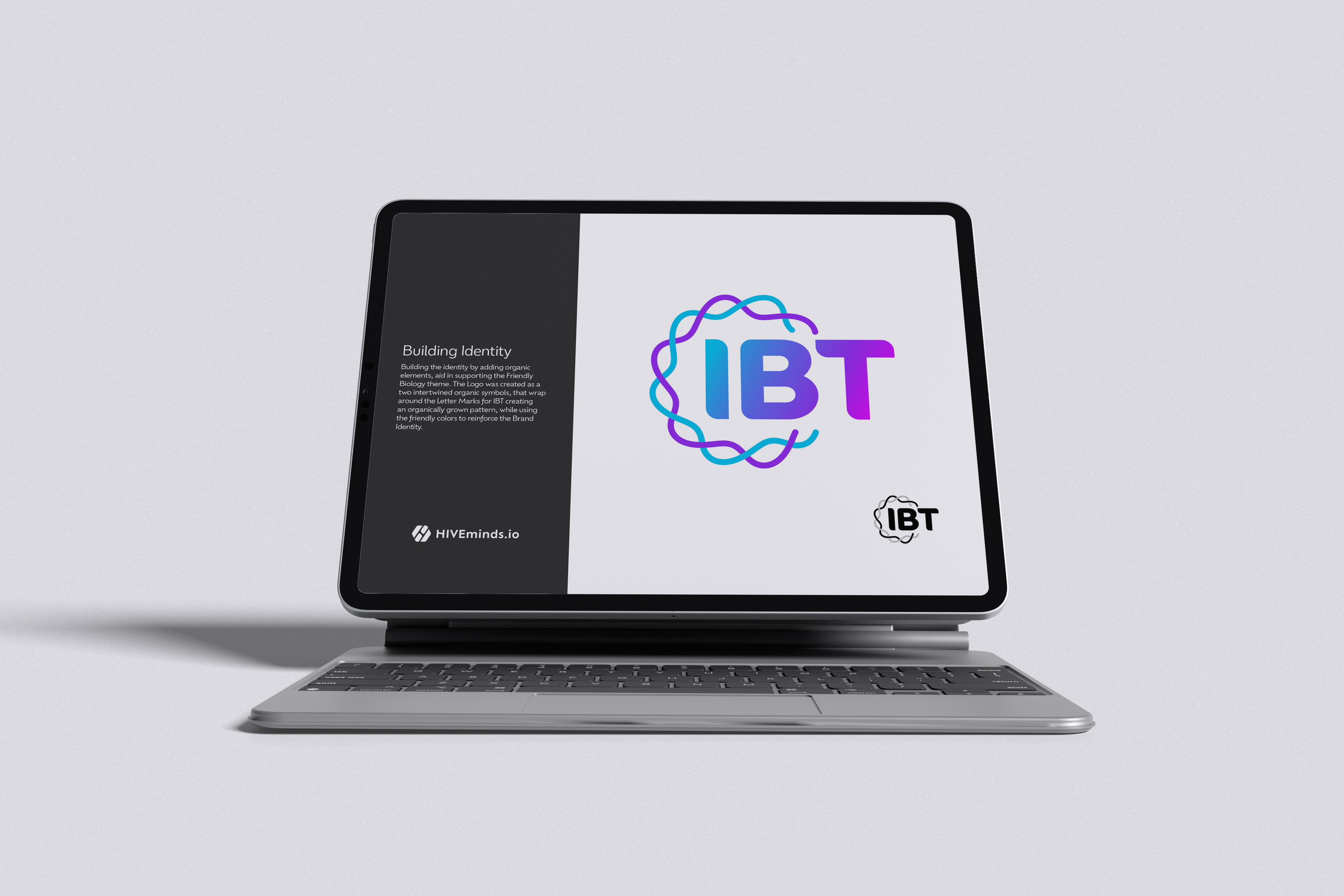
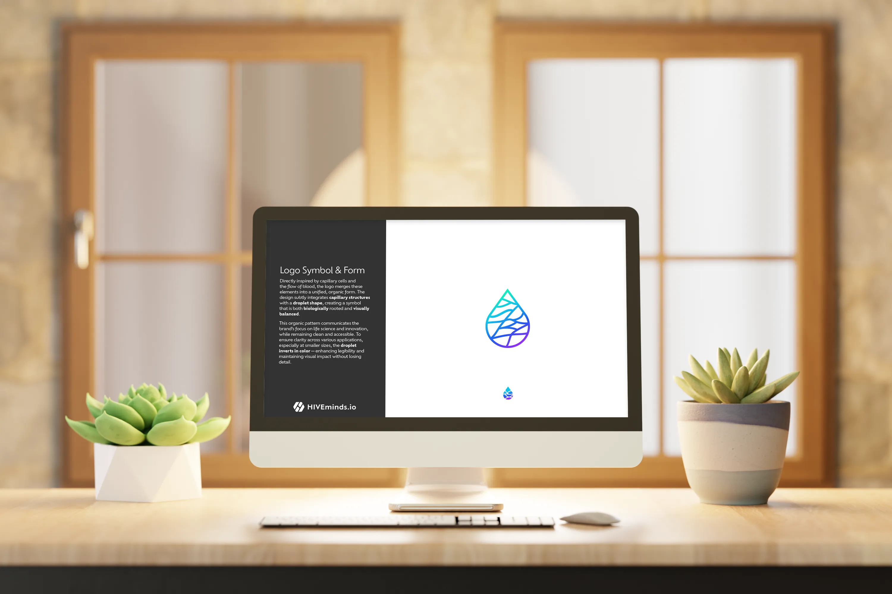
Innovative BioTherapies Style Guide
Innovative BioTherapies, Inc. (IBT), is a for profit company founded in 2003, by Dr. H. David Humes, Professor of Medicine at the University of Michigan, to facilitate the commercialization of technology developed in his academic laboratory.

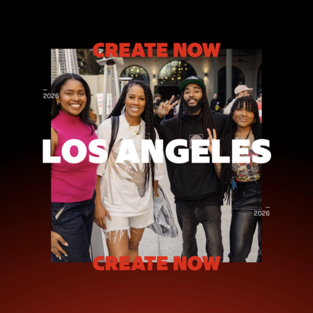
AI Event Winner
Machine Cinema LA Event Winner!
What even is a sport? For our next GenJam, we’re working with our friends at Echobend to throw you into the arena with nothing but your imagination and a handful of weird, seemingly unrelated objects. Your mission: invent a new sport from scratch—and show us how it works. Think: a broom, a hoop, and a golden ball with wings. Never heard of Quidditch? Exactly.
Brand Guide Style Guide Visual Identity
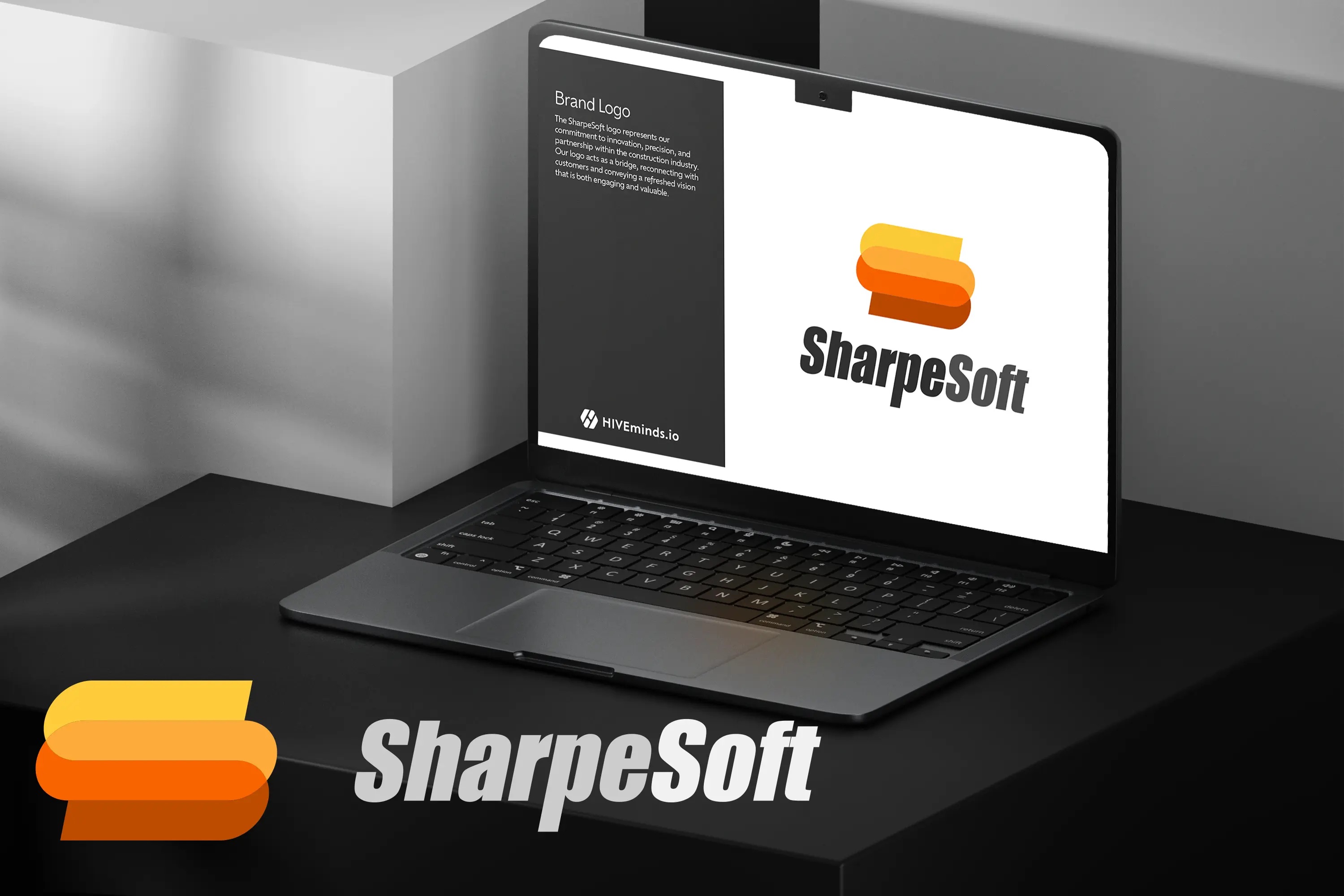
SharpeSoft Style & Branding Guide
With over 38 years of providing industry-leading estimation software for the construction industry, SharpeSoft has embarked on a journey to modernize its branding and visual identity.
Style Guide Visual Identity
Refined Innovative BioTherapies Style Guide
Innovative BioTherapies, Inc. (IBT), is a for profit company founded in 2003, by Dr. H. David Humes, Professor of Medicine at the University of Michigan, to facilitate the commercialization of technology developed in his academic laboratory.